This article is the updated entry of this one.
Here I will summarize how to customize buttons and how the theme them. Honestly, with previous versions, the way to customize them wasn’t very clear, and sometimes was a bit tricky to make use of the Material Design with them.
Fortunately, this is not anymore the case and we can enjoy an easy and clean way to customize our buttons.
First of all. Let me point out what are the differences among the common Flutter buttons and how they are related.
FlatButtonnow is TextButton extends ButtonStyleButton.RaisedButtonnow is ElevatedButton extends ButtonStyleButton.OutlineButtonnow is OutlinedButton extends ButtonStyleButton.- IconButton builds a ConstrainedBox with Inked Widget.
Deprecated:
MaterialButton builds RawMaterialButton.Now it is used a ButtonStyleButton child.RawMaterialButton builds a ConstrainedBox with Inked Widget. Now it is used a ButtonStyleButton child.
Buttons with Icon
Use ElevatedButton.icon or OutlinedButton.icon to get a button with a prefixed Icon.
Customize Button
Big difference compared to old Buttons (and that is good!)
The style of the buttons now are based on the class ButtonStyle
A very friendly way to change the style of a particular button is using TYPEBUTTON.styleFrom(…).
For an OutlinedButton, we can use:
final ButtonStyle style = OutlinedButton.styleFrom(
textStyle: const TextStyle(fontSize: 20),
primary: Colors.purple,
onPrimary: Colors.green,
onSurface: Colors.red);
- primary to change the background color when it is enabled (onPressed != null)
- onPrimary to change the Icon or text color.
- onSurface to change the color when the button is disabled (onPressed == null)
But for better-grained management of colors, we can create our own ButtonStyle which uses MaterialStyleProperty.
Many of the attributes in ButtonStyle are this new class type: MaterialStyleProperty and this new class deserves to be seen deeply:
MaterialStyleProperty
Why is important this class? and what we can do with it?
This class will give us the attributes for our ButtonStyle using these methods.
MaterialStylePropery.resolveWith( (Set<MaterialState>)->Color )
or
MaterialStylePropery.all(Color.red)
We will be able to check what is the current state of the button and return the color we want. For example.
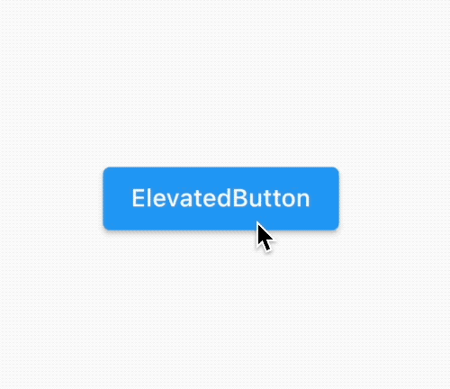
If we want to display a red color when the user is interacting with the disabled button then 2 choices:
ElevatedButton(
  style:ButtonStyle(
            backgroundColor: MaterialStateProperty.resolveWith((states) {
              if(states.contains(MaterialState.disabled)) return Colors.purple;
              if(states.contains(MaterialState.pressed)) return Colors.amberAccent;
           }),
       ),
 onPressed: null,
 child: Text("ElevatedButton")),
or
ElevatedButton(
    style: ElevatedButton.styleFrom(onSurface: Colors.purple.withOpacity(0.38),
    onPressed: null, child: Text("ElevatedButton")),
|
 |
Fortunately, this time Flutter is consistent with MaterialDesign and the states (MaterialState) that a Button can take are the ones specified in MaterialDesign
|
 |
Some important attributes:
- textStyle: You can define font, size of the text.
- backgroundColor: The color for the background. The default color is Theme.colorScheme.primary defined in the Theme.
- foregroundColor: The color of the text or icon Theme.colorScheme.onPrimary
- shape: Shape of the button (see below)
- padding: Padding of the button
About the shape
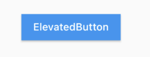
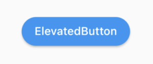
ElevatedButton(
      style:ButtonStyle(
            shape: MaterialStateProperty.resolveWith((states) => RoundedRectangleBorder(
                   borderRadius: BorderRadius.all(Radius.zero)
                 ))
            ),
            onPressed: (){}, child: Text("ElevatedButton")),
|
 |
ElevatedButton(
    style:ButtonStyle(
          shape: MaterialStateProperty.resolveWith((states) => BeveledRectangleBorder(
                   borderRadius: BorderRadius.all(Radius.circular(9))
                 ))
          ),
          onPressed: (){}, child: Text("ElevatedButton")),
|
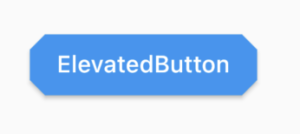 |
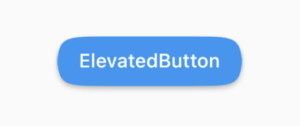
ElevatedButton(
    style:ButtonStyle(
      shape: MaterialStateProperty.resolveWith((states) => StadiumBorder(
      ))
    ),
    onPressed: (){}, child: Text("ElevatedButton")),
|
 |
ElevatedButton(
     style:ButtonStyle(
          shape: MaterialStateProperty.resolveWith((states) => ContinuousRectangleBorder(
                borderRadius: BorderRadius.all(Radius.circular(40))
              ))
            ),
     onPressed: (){}, child: Text("ElevatedButton")),
|
 |
ButtonBar
And finally! we got consistency with MaterialDesign, as we can see here buttons look exactly the same as standard buttons in Flutter.

Ok, now we know how we change a particular Button, what about if we want changes in the whole App? Let’s see the themeing
Theming
Color colorScheme.primary (Normally defined by the primarySwatch) will be used as a color for the background.
You can use a ThemeData with a primarySwatch to change the colors, or create a colorScheme to change the foregroundColor.
But probably these colors are used in many other widgets (like the AppBar) and you just want to customize your buttons. Let’s see how to do that.
In ThemeData there are three main parameters:
- elevatedButtonTheme. Needs a ElevatedButtonThemeData
- outlinedButtonTheme. Needs a OutlinedButtonThemeData
- textButtonTheme Needs a TextButtonThemeData
You just need to provide the style (ButtonStyle) that we have seen before and voila! So easy this time!
MaterialApp(
      title: 'Flutter Buttons Theme Demo',
      theme: ThemeData(
        elevatedButtonTheme:  ElevatedButtonThemeData(
            style: ElevatedButton.styleFrom(primary: Colors.green)
        ),
        outlinedButtonTheme: OutlinedButtonThemeData(
            style: OutlinedButton.styleFrom(primary: Colors.purple)
        ),
        textButtonTheme: TextButtonThemeData(
          style: TextButton.styleFrom(primary: Colors.red)
        )
|
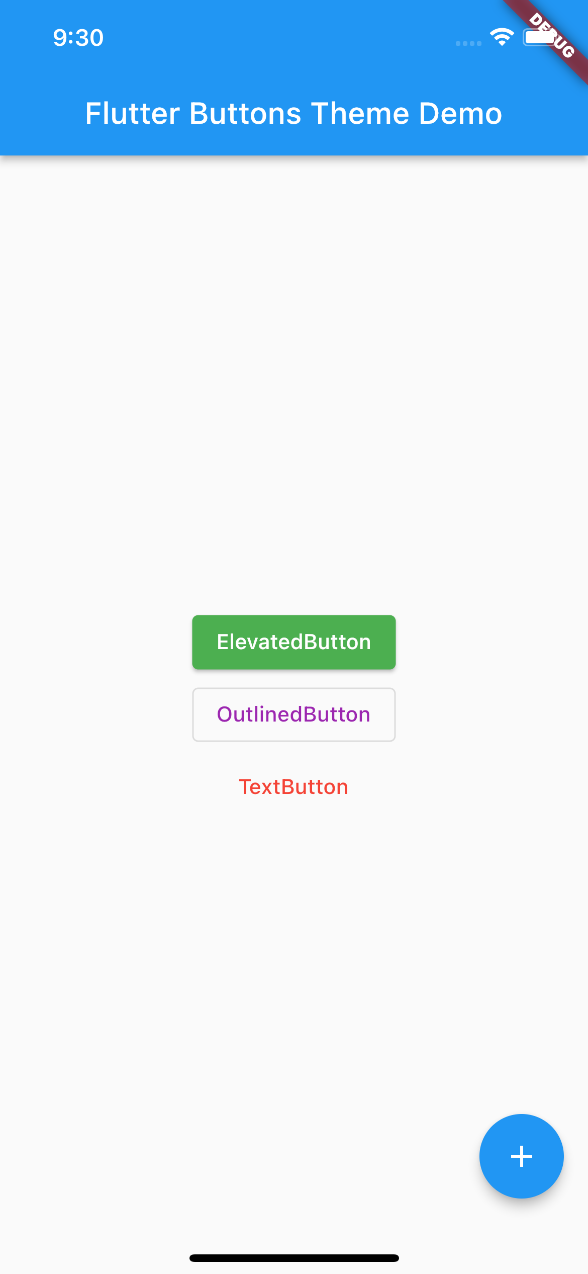 |
So glad we can enjoy this new way to customize buttons in Flutters. I hope this article was useful to you!
Happy Flutter coding!